New Delhi: When it was announced that this year's Nobel Peace Prize was awarded to Nihon Hidankyo, a Japanese group made up of survivors of the Second World War atomic bomb attacks in Nagasaki and Hiroshima, all we got to see on the Nobel Prize website was a representational sketch of the group's logo, a dove symbolising peace.
This is not the original logo. The original logo on the winning group's website depicts the words Nihon Hidankyo in English and Japanese and the subtext "Japan Confederation of A- and H-Bomb Sufferers Organisations" written in Japanese. However, the Nobel Prize website simply had a sketch of the dove with bold black lines and gold foils.
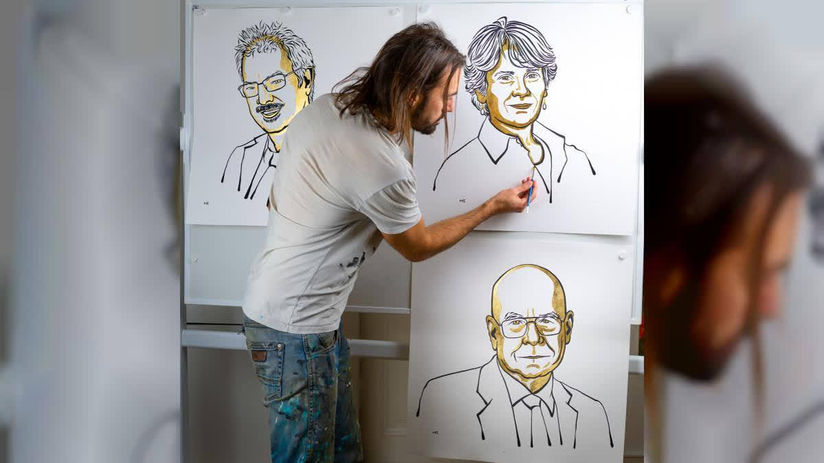
Nihon Hidankyo is an organisation. What about other individual winners in different categories? The winners of this year's Nobel Prizes in physics, chemistry, physiology or medicine, and literature have also been depicted with their portraits and not with their photographs. And so has been the case since 2012 when Niklas Elmehed was appointed as the art director of the Nobel Media and was entrusted with the responsibility of all visual content related to Nobel Prizes.
According to the official website of the Nobel Prizes, the portrait style was chosen because it is "unifying and welcoming" and works well in small formats like mobile phones. However, this has not been the case prior to 2012.
In the early years of the Nobel Prize, which began in 1901, laureates were typically represented through formal photographic portraits. These images were often commissioned or provided by the laureates themselves and were used in the official Nobel Prize announcements and documentation. The photos varied widely in style, depending on the laureate's background, the time period, and the quality of the available technology.
However, even in these early days, some notable laureates were depicted in painted portraits, especially for ceremonies or institutional displays. These paintings were often commissioned for academic institutions or Nobel Prize-related exhibitions. These early artistic representations were more classical, often created by local or regional artists, and were less standardised than the modern portraits used today.
During this time, there was no single artist or unified style associated with Nobel Prize portraiture, as the focus was largely on practical and photographic representation.
During the mid-20th century, photography remained the dominant form of portraying Nobel laureates. However, the visual presentation became more formalised as the Nobel Prize organisation began to standardise its publications and visual materials. Laureates were still typically represented through black-and-white or colour photographs, often with a formal and solemn tone to match the seriousness of the award.
In some instances, painted portraits continued to be commissioned for notable laureates, especially for exhibitions or displays in institutions associated with the Nobel Prize. The transition period during these decades saw a mix of mediums, as photography was becoming more accessible and digital reproduction was still in its infancy.
In some cases, Nobel laureates may be individuals who highly value their privacy or may not have high-quality or public photographs readily available. For instance, winners of the Nobel Peace Prize or individuals working in sensitive areas may not wish to have their personal photos widely disseminated due to security, privacy, or personal preference concerns. An official portrait can provide a respectful and less intrusive alternative to broadcasting a laureate's image widely.
The turn towards a more unified portraiture style was catalysed by the need for cohesive digital platforms, and a shift began towards custom-created portraits for all laureates. However, there wasn't yet a singular artist responsible for this, and different approaches to portraiture continued to be explored.
The real breakthrough in the artistic representation of Nobel Prize winners came in the 2010s when Swedish artist Niklas Elmehed was commissioned to create the official portraits for the Nobel laureates. Elmehed’s work marked a departure from the earlier reliance on photographs and began a new era of Nobel portraiture.
In his personal website, Elmehed explains how the whole process evolved.
"I was hired as the art director of Nobel Media and responsible for all visual content during the announcements 2012," he explains in the FAQ section of his website.
"This year I made my first quick portrait sketches with a black marker and the reason was that I couldn't find photos of some of the Laureates to publish on Nobel Prize's official digital platforms. Some of the sketches were picked up and used by big news media and (in) 2014 I got the job to create a visual style for the official portraits. I came up with the idea of black outlines together with blue and yellow shadows and highlights."
According to Elmehed, the graphical concept behind the portraits is to give the portraits the expression of breaking news - a strong and unique visual impression. However, in 2017, it was decided that the main colour for the announcements would be gold, preferably gold with texture not just a representational colour.
"I adjusted my blue and yellow paintings, which was the look 2014-2017, to the new golden look," he states. "I experimented a lot with different gold paint and fell for the gold foil, a super thin metal foil that you can put on the painting with a special glue. Together with black outlines, painted on a white background, I think the portraits have a very strong and exclusive impact."
Though Elmehed’s is a work of love for art, Nobel laureates have seldom acknowledged his contribution to the Nobel committee.
"Actually I have never received any feedback from the laureates. I guess they are too busy the time after they have been awarded the Nobel Prize," he states.


